
ART
VEKTR
[V]: designing the app icon
An app icon is the first thing anyone sees of a mobile game, often at the size of a fingernail. Here's how Vektr's came together.
Redshift Interactive · October 23, 2026

Why brackets
The name Vektr comes from vectors, and in math, a letter wrapped in square brackets is one way of writing a vector. So the icon is just the game's initial in vector notation: [V]. It's simple enough to read at any size, and it doesn't look like any other tower defense icon on the store.
Colors from the game
Every color in the icon already means something inside Vektr.
- Gold brackets. Gold is the game's color for the big moments: major unlocks, three-star wins and new bests. The brackets are thick and metallic, with an edge highlight, a diagonal sheen and a small glint on the top-left corner.
- A cyan-to-mint V. Cyan is the color of the Bullet node, and mint is the color of Bits, the currency every kill earns. The V fades from one into the other.
- Deep violet behind it, with a soft glow behind the V so it lifts off the background, the way nodes glow on the dark board in-game.
One icon, four shapes
On Android, an icon doesn't get to be just one picture. Different phones crop it into rounded squares or circles, and newer versions of Android can recolor it to match your wallpaper. So the [V] ships in several forms:
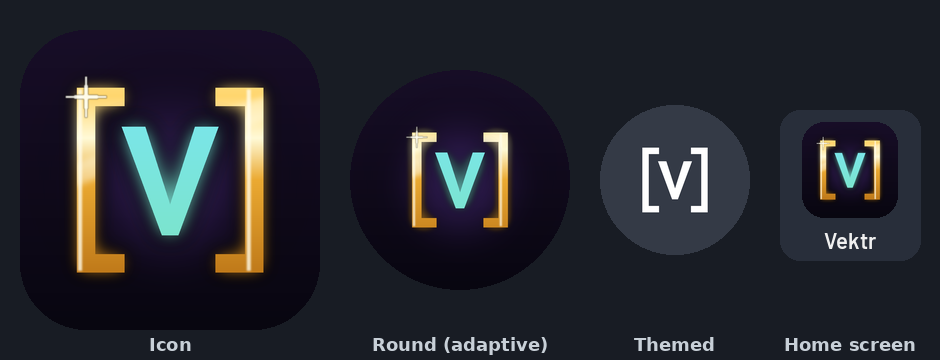
- Adaptive icon: the [V] and its background are separate layers, so the phone can crop it to its own shape without cutting off the brackets.
- Themed icon: a single-color version for Android's themed icons, where the brackets and V still read clearly without any of the gold or glow.
- Store icon: a large master copy, plus the 512-pixel version Google Play uses for the store listing.
Follow along and get closed-test news in our Discord.
JOIN THE DISCORD